


CAREER GROWTH
BASIC PRINCIPLES FOR UI/UX DESIGN

NOVEMBER 18, 2019

The demand for UI/UX Designers today continues to grow, as businesses are realizing more and more the importance of their interfaces and the experiences that users get from interacting with their product.
It’s vital to learn the basic principles for UI/UX design, as well as the key concepts, and techniques, especially when you’re entering a new field or even trying to master your skills to become the best UI/UX designer.
In this article, we’ll discuss some of the basics that go into good UI and UX – this includes visual design principles, UX principles, and UI principles.
CONTENTS
1 Basic Visual Design Principles
- 1.1 Color
- 1.2 Typography
- 1.3 Balance
- 1.4 Proximity
- 1.5 Alignment
- 1.6 Repetition
- 1.7 Space
- 1.8 Contrast
BASIC VISUAL DESIGN PRINCIPLES
Knowing basic visual design principles should not be limited to graphic designers since an important aspect of good UI/UX design are the visuals and graphics that go into it. Here are some visual design principles that every UI/UX Designer should know.
COLOR
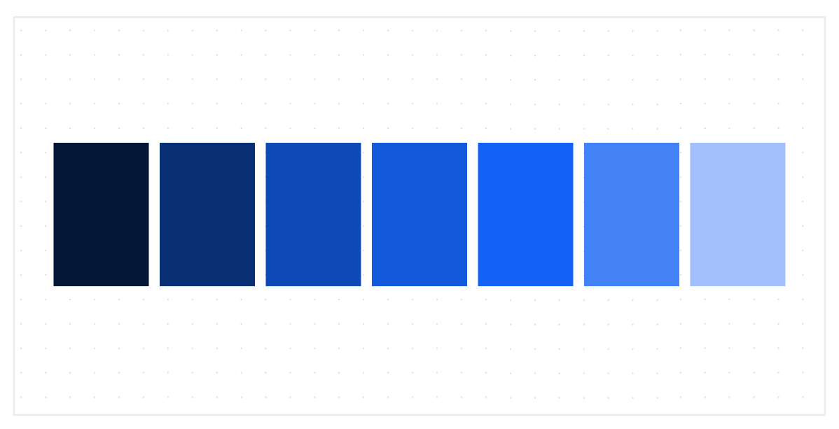
Color is one of the most basic principles of design. It’s everywhere and used for so many things. Color creates mental associations and can evoke different kinds of emotions. In business, colors are usually used to create brand colors. If done correctly, these colors can become strongly associated to the brand itself – think of the violet of Cadbury, red & yellow of McDonald’s, or the green of Starbucks.
As a designer, the colors you pick can represent your brand. This is why it’s a good idea to get to know about Color Theory as well as the psychology of color and how it can affect the tone and mood of your brand or designs.
TYPOGRAPHY
“Typography is the craft of endowing human language with a durable visual form.”
- Robert Bringhurst, “The Elements of Typographical Style”
IMAGE: Logo Design Team
Picking a font style for designs may seem like a small detail, but in fact, typography is a key pillar of design and a driving force for visual communication. It can create an impression of power or other emotion to your messages. A lot of brands put heavy importance on typography – so much so that they hire experts to develop their own, unique font.
Typography combines style, appearance, and structure with the goal of creating text that is aesthetically pleasing and easily readable to users. It can make or break your brand because it affects how readable your content is. If users can’t read the text on your website or designs, then there’s no point.
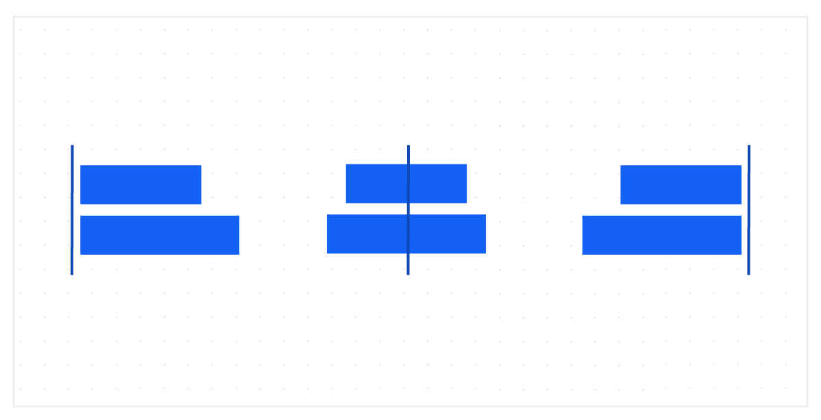
BALANCE
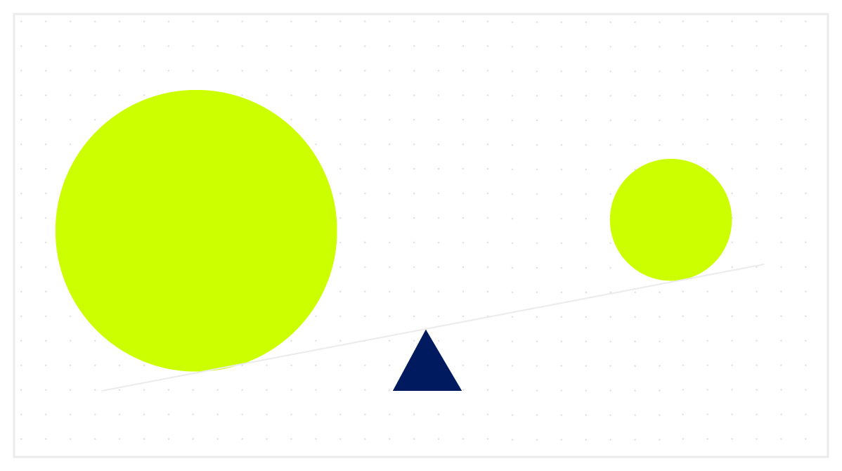
Balance is the way elements are distributed in a design. It provides a sense of stability and structure. As humans, we subconsciously look for balance and symmetry, making it an important principle of any design. Balance can be created through scale, contrast, or color.
PROXIMITY
Proximity refers to how close or far elements are to each other. This is a good way to indicate relationships between these elements or to create a focal point. Most of the time, distance is used to create proximity, however, there are other ways to achieve proximity. As long as elements are visually connected, it can create the impression of proximity. This can be done through techniques like alignment or repetition.
ALIGNMENT
Alignment is the way elements are positioned so they line up in a composition. Alignment creates organization and can be used to establish hierarchy. The way elements are aligned can create a visual connection with each other, create balance, and give an ordered appearance.
REPETITION
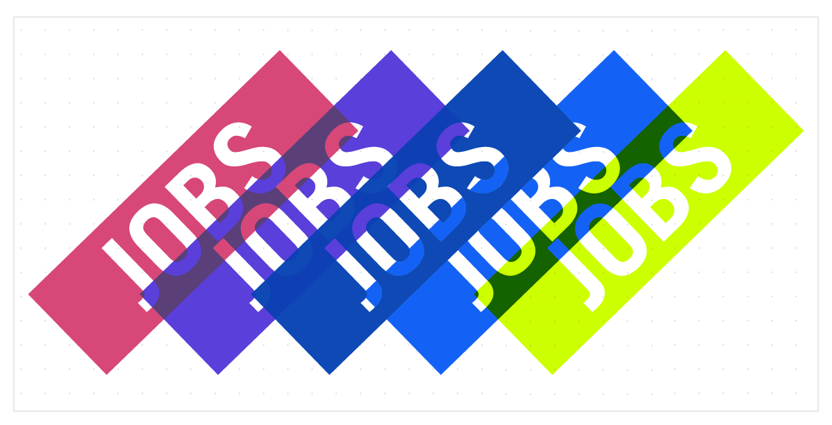
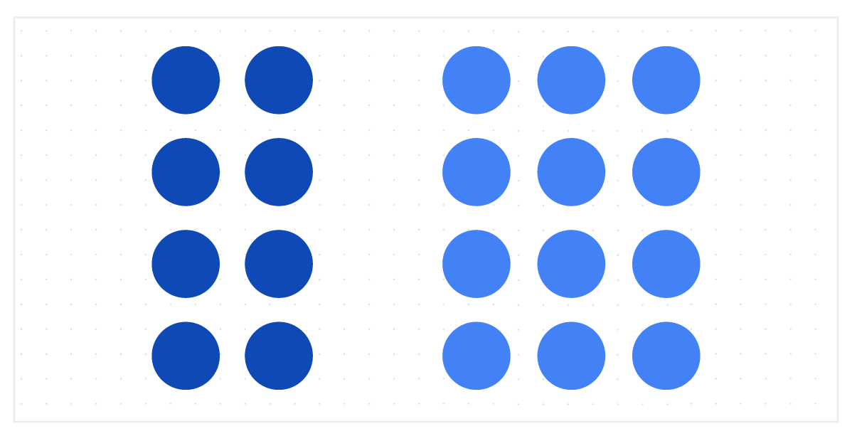
Repetition is using elements more than once. Repetition is highly important in branding by tying together consistent elements. Color is often used in repetition to establish brand (as mentioned in the color section). Repetition is also used to create rhythm and a sense of movement.
SPACE
“If everything yells for your viewer’s attention, nothing is heard.
- Aaron Walter, “Design for Emotion”
Space refers to the area between, around, or within elements. An important type of space often used is “negative space”, or the area where there are no elements. Negative space can be used to enhance visual hierarchy by highlighting specific elements in your design.
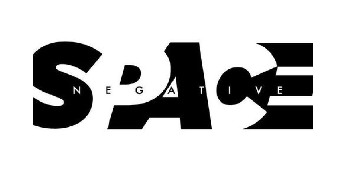
IMAGE: Andiey Magazine
In terms of websites, negative space can make it easier to scan through a page because it gives the page some “air” and makes the page feel uncluttered. Another important way space is used is through line spacing. When line spacing in a website is too small, it makes it hard to read and causes readers to exit the page instead of interacting with it – something you never want to happen.
CONTRAST
Contrast refers to the arrangement of opposite elements like big and small, dark and light, rough and smooth, etc. Contrast happens when there is a difference between these two opposing elements.
In UI/UX, contrast helps establish hierarchy by guiding viewer’s attention to key elements. It allows you to make more important content standout, or make less important things fade into the background.
UX DESIGN PRINCIPLES
Knowing the basic visual design principles is important in UI/UX, but to become a great UI/UX designer, it’s important to learn basic UX and UI principles as well.
Let’s start with the most important UX design principles that help make up good user experience: hierarchy, consistency, confirmation, user control, and accessibility.
HIERARCHY
Hierarchy is the way information is arranged or presented – usually it is done in order of importance. Hierarchy helps users move through a product easily and influences the order that the human eye perceives what it sees. It adds structure and organization in designs and products.
When applying hierarchy to UI/UX design, there are two types: Information and visual.
Hierarchy of Information
Hierarchy of information is a type of information architecture, or the way content is organized across an app or website. The best example of information hierarchy are navigation bars.

Navigation bars are primary navigation menus that are at the top-level of information hierarchy. It shows the main parts of an app or website. Beneath each item might be a secondary menu that navigates to more specific parts of the app or website. This continues downwards all the way to individual pieces of content. You can establish proper information hierarchy through categorization.
This type of hierarchy is often taken for granted because it feels like a natural process during design, but getting it correct is essential for a smooth navigation process and user experience.
Visual hierarchy
The second type of hierarchy is visual hierarchy, or the way information and elements are organized so users know and understand the hierarchy. Visual hierarchy helps users easily navigate within a page.
There are several ways visual hierarchy can be achieved:
- Contrast – making more important content stand out
- Headings – using bold text, larger font sizes, etc.
- Color – using shades of a color to build hierarchy
- Alignment – indentations for sub categories
- Proximity – combining like elements together and giving more space to any sub-categories
CONSISTENCY
Users expect products to be consistent with other products they’ve used or continue to use. This means that UI/UX Designers don’t need to reinvent the wheel every time they create designs. The best way to make products usable is to use elements and techniques that already work and using the interfaces that users already know and are used to.
Consistency also applies to elements within your content such as blog cards, buttons, and even things like color and typography. Consistency helps with usability and experience, but it also helps with branding.
Another way to establish consistency is through design language. Design language is a formal set of guidelines on how to design products for a specific devise. These guidelines are different for iOS developers and Android developers. You can find them below:
- IOS developers: https://developer.apple.com/design/human-interface-guidelines/ios/overview/themes/
- Android developers: https://material.io/design/
CONFIRMATION
Confirmation is important in products that require repeated validation, such as bank transfers, deleting messages, or online purchases. Requiring users to confirm important actions like that, helps prevent errors – which is something that UI/UX designers should strive for.
Preventing errors ensures that the user has a good experience because once they encounter errors, their experience begins to fall apart. The best way to prevent this is by requiring confirmation for important or irreversible actions.
You can apply visual hierarchy or contrast to build confirmation interactions and to highlight the fact that this is an important action that needs a user’s complete attention.
USER CONTROL
Essentially, user control is making the user feel like they have control over your product so they don’t feel lost within the navigation. Adding interactions like back, cancel, undo, “^ back to top”, or even search buttons provide greater flexibility of use and better control within the product. This also allows users to go back or recover from mistakes.
ACCESSIBILITY
Accessibility ensures that anyone can use your product – including those with disabilities. The best example of this is accessibility options on your mobile devices where you can do things such as increase font size, increase contrast, provide audio descriptions, and more. Accessibility removes obstacles for people and ensures that it is easy to use by anyone.
UI DESIGN PRINCIPLES
Lastly, let’s quickly go over some UI principles. While there are several factors you need to consider when it comes to the interface of your product, the following are basics you should master for best practices.
SIMPLICITY
Good UI is simple and natural. Natural UI design doesn’t force users to change the way they interact with products but keeps things consistent. Keeping UI simple means making sure interactions don’t need extra explanations.
The goal is to make common tasks easy, communicating interactions clearly, and using simple language in your messages. Ensure also that your interfaces don’t contain useless elements or information – reduce noise and keep things simple for your user.
VISIBILITY
Visibility ensures that all options and materials are visible to the user, making navigation clear and self-evident. You can improve visibility by providing visual cues, which are reminders for users. Things like page titles or highlights for currently selected options improve visibility of your product and ensures that users know where they are in the interface.
Visibility also means that users know about the system status – this applies to actions that take time, like downloading a file. Users don’t like to be left with a blank screen with no information on where they are, so showing the system status or progress is key.
FEEDBACK
For every action, there needs to be a clear reaction. Design needs to be interactive and needs to provide feedback for users. This means that when user clicks an element, there needs to be a response that shows that the command was received. Just like when you hover over hyperlinks, sometimes the text turns blue, or an underline appears, or the arrow cursor becomes a finger.
The type of feedback you choose depends on your design. When you click an icon, it can move, change shape or color, vibrate, etc. Sometimes you can use this feedback to communicate an actual message – like when the feedback is a quick shake left and right, it mimics the way humans shake head left and right to say no – which can indicate failure of command or an error.
TOLERANCE
Designs should be flexible to reduce mistakes by allowing undo and redoing – this ties into user control which we discussed earlier.
Tolerance also means ensuring that you are able to accommodate users with different skill levels. Not everyone knows how to interact with technology and products, so adding features that help newbies is a good idea – such as tutorials or step-by-step instructions when they first interact with your product.
CONCLUSION
UI/UX Designers today have a big job. More than ever, their role is vital in the success and failure of products, so the goal of every UI/UX Designer is to master the principles that go into creating beautiful, user-friendly interfaces. User Interfaces will continue to develop moving forward, changing the way users will experience these products. But mastering the principles discussed in this article will get you on the right track of becoming the best UI/UX Designer you can be.
ADDITIONAL RESOURCES
NOVEMBER 18, 2019